Monday, 30 April 2012

Cover Ideas

After choosing my style of drawing, my media, and page layout style, I decided to go about creating some possible cover designs. The first thing to decide was what font I was going to use.


After trying a few different ones, I ended up settling on the Impact Label Reversed font. This decision was mainly based on the fact that the style reminds me of the labels we have at work to classify books.


For the cover itself, I decided I wanted to have the title of the series of books at the top, and I also wanted a subtitle of the story at the bottom of the page. These were a few rough ideas I had for two of my stories.


Simplifying Figures Down

During my process of practising my figure drawing, I realised that when it came to drawing figures in the situations that I wanted them in, I just couldn't draw the figures realistically. This could possibly be due to the fact that I had grown up with mainstream comics such as the Marvel publications, and automatically tried to emulate their style of working.


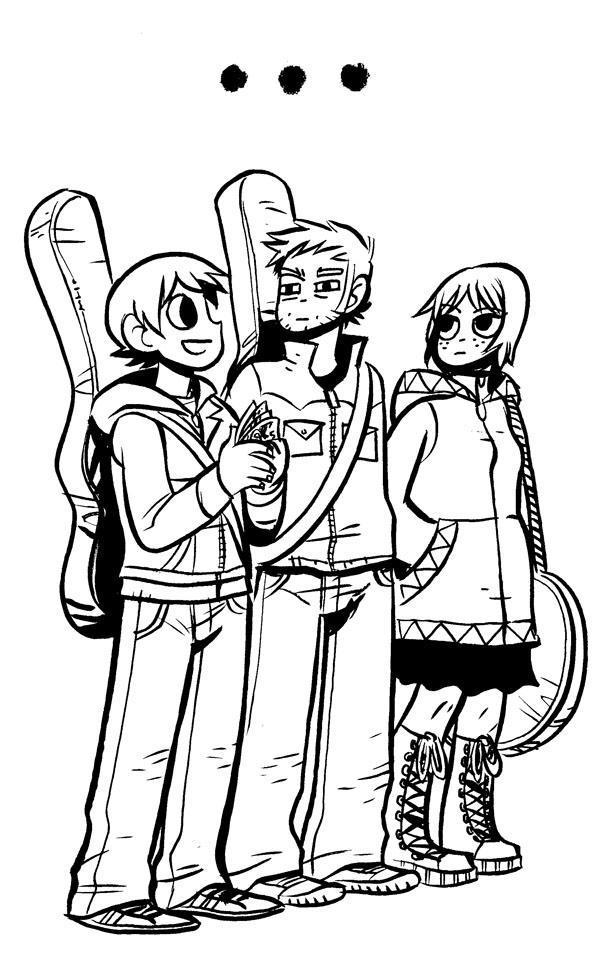
So when I realised that method of working wasn't suited to me, I decided to try and simplify my figures down. To help me with this, I drew inspiration from such publications as The Beano comics, and the works of illustrator Bryan Lee O'Malley (Scott Pilgrim & Lost At Sea).


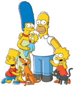
I also looked at how certain animation studios simplify characters down, looking at animations such as Family Guy, American Dad and The Simpsons, who not only simplify their characters down but also exaggerate certain features of a persons appearance to create a comical effect, for example the size of the father's strong jaw bone in American Dad to exaggerate the character's alpha male nature. In these animations, and also in the publications above, I found that simplifying things down actually complimented their light hearted humorous stories, which is what I wanted for my stories. If the figures had been drawn anatomically correct, the mood of the pieces may have changed to be more serious.

After looking at their simplified styles, I tried tried out using a more simplistic approach to my figures. The outcome actually proved, in my opinion, to compliment the feeling of the humour of the stories I had written, and I ended up liking simplifying the characters, so the experiment turned out to be a very positive one.


Book Construction

For gaining ideas of how to go about creating my books there were really two options, either send my pages off to get printed professionally or print the book myself. As I have said previously, I rather like the look of comics that go against the professional look of the mainstream comics, and I also like the appearance of something that looks like it has taken time and effort into making. After looking at what facilities were available to me, I took the decision that I wanted to make the the books myself. The question I then asked myself was in what way would I choose to make it myself.


 The first thing I took into consideration was what size they were going to be. Usual mainstream comics are around about 9.5 inches by 6.5 inches, so the first thing that came to me was do I stay the same size, or do I go bigger or smaller? I knew that I wanted my books to look different to the regular comics, so I tried out different sizes, along side different materials as well.


The first experiment I tried was to go smaller, this was to try out what it would look like as a little booklet type comic. I also tried using quite flimsy card and bound the pages together with staples. Looking at the end result of this experiment, I realised that not only was the size too small, but the flimsy card just didn't fit my vision of what I wanted the books to look like.  


For my second experiment, I decided to increase the size of the book to A4 size. I also tried using a rougher card for the cover, and used separate sheets of Ripple Embossed white card for the inside pages. I bound the book using the university's professional book binder, which uses a special glue to hold the pages of the book to the cover. Whilst I liked the feel of the texture of the card on the pages, and the binding process to hold everything together, I found I wasn't that fond of the rough card for the cover. I also didn't think the card would cope well with the printing process. I decided to try and find a smoother, yet still strong type of card for the cover.


In the end, I found a sturdy yet smoother type of cream that felt perfect for the outer cover. I felt suitable for the printing process for when I wanted to print the out cover, and was even suitable if I felt like I wanted to do inside sleeve artwork.

Sunday, 29 April 2012

Page Layout


Whilst storyboarding my stories, and trying out a traditional way of presenting a comic, I decided that I didn't want the page layout to be the usual boxed format that the mainstream comics seem to stick to, to make my stories stand out. I decided to do some research into the indie market, who most of the time set themselves apart from their mainstream counterparts. Whilst researching I came across the works of Benjamin Flao, who presented stories through full page layouts, and instead of having boxes, the images seemed to flow and merge into one another in a way that was coherent and easy to follow a story.


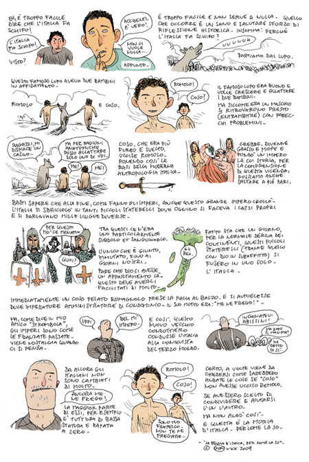
Whilst looking at Gipi's work for inspiration for media, I noticed he also defied the normal boxed format of the mainstream comics by having most of the text floating around his images rather than having them boxed in.


Storyboarding

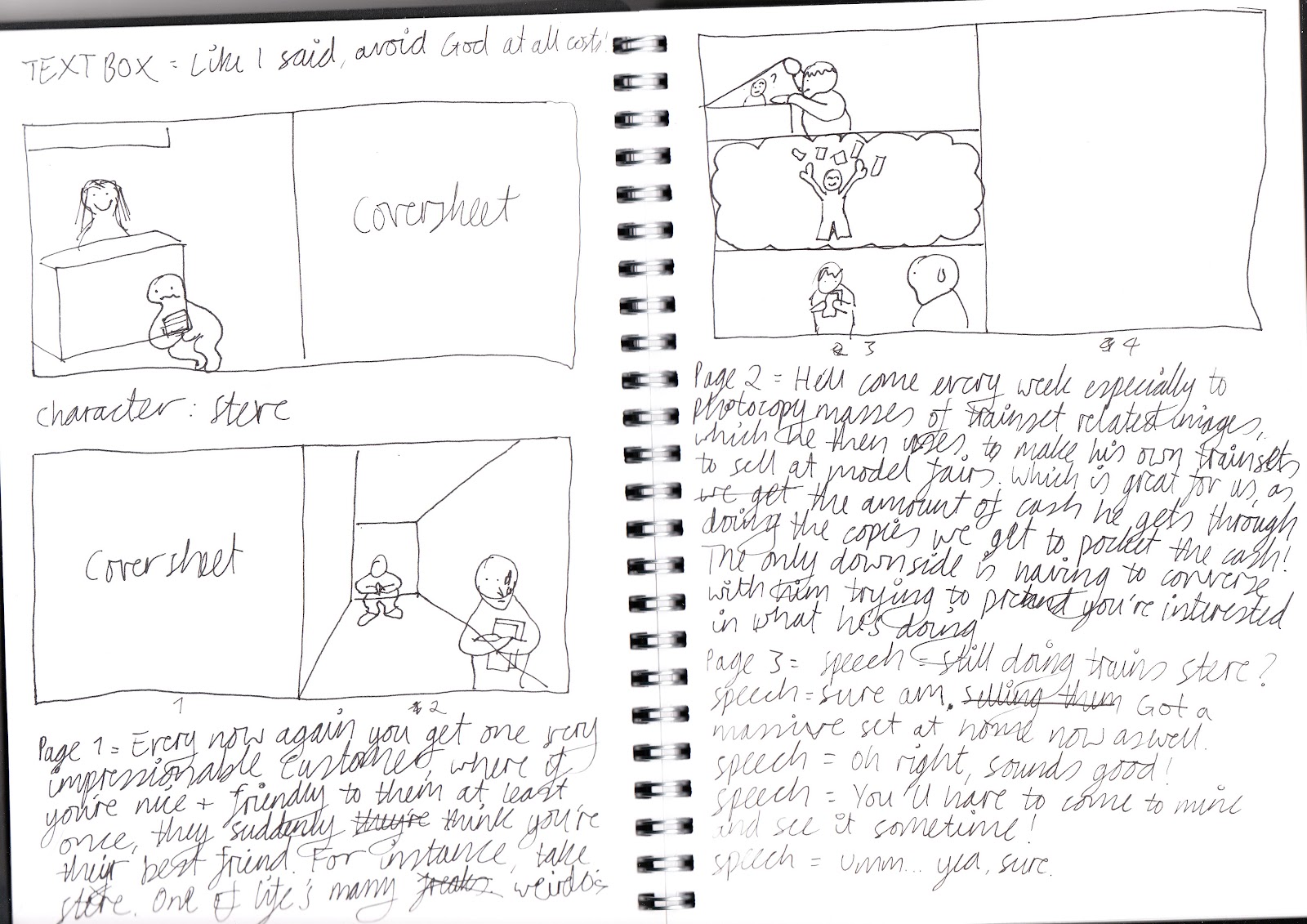
Once I had built a series of character profiles up, and pieced together parts of stories they had told me, I started to do rough storyboards of stories of not only my characters, but of certain things that have happened to me whilst working at the library. From doing these story boards, I decided that my final outcomes were going to be four separate comics. Two of these were to be stories about characters I had encountered at work, and the other two were to be lessons I  had learnt from work at the library.


My Chosen Media

After gaining inspiration from Gipi, I decided to try using inks in my work to see how it worked in the vision I had for my stories. I found when trying this, the inks seemed to compliment my line art quite well, and I feel that  the inks bring life to my figures. Therefore, this was my chosen media to use for my stories.


Gipi

Whilst finding myself stuck in a rut trying to find a medium to apply to my stories, I decided to read some independent comics to draw some inspiration from styles that differ from the mainstream market. One person's work that really stood out for me was the work of Italian cartoonist Gipi. I was instantly drawn to his traditional look and his use of inks. I find that the use of traditional media, as opposed to digital media, gives an image more of a sense of character, not only that, but it also gives the artwork the feeling that a lot of time and effort has gone into making into making it.